- ARAB NEWS
- 30 Jun 2025

Nader Sammouri
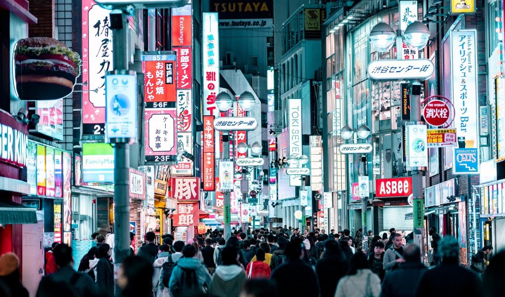
OSAKA: The composition of advertisement boards in Japan has grown to become a massive piece of art plastered against the walls of buildings. This is especially the case in Tokyo and Osaka, where the bright radiance of the boards make it seem as though the city never goes to sleep.
There can be little doubt that the landscape of neon lights showcased throughout these cities aid in giving it a sense of prosperity and excitement. On top of that, the neon lights allow the city to express its vibrant atmosphere.
Why does Japan have so many neon advertisements boards?
 Neon signs of Tokyo, Japan. (Supplied)
Ever since the 1960s, neon signs arose across cities as a form of innovative advertisement that allowed Japanese business owners to appeal to a bigger audience. This act then expanded into a whole jungle of neon boards, creating a masterpiece shaped by abundantly diverse businesses.
Large companies such as Sony began switching their board lights on, which eventually intrigued more businesses to follow. A plethora of signs, from giant billboards to small window signs erupted.
Although the signs postured as a trademark of territory, the irony of the situation lied in that the symbols that were meant to market diverse businesses became too cluttered to be seen individually, which made them lose their advertising purpose.
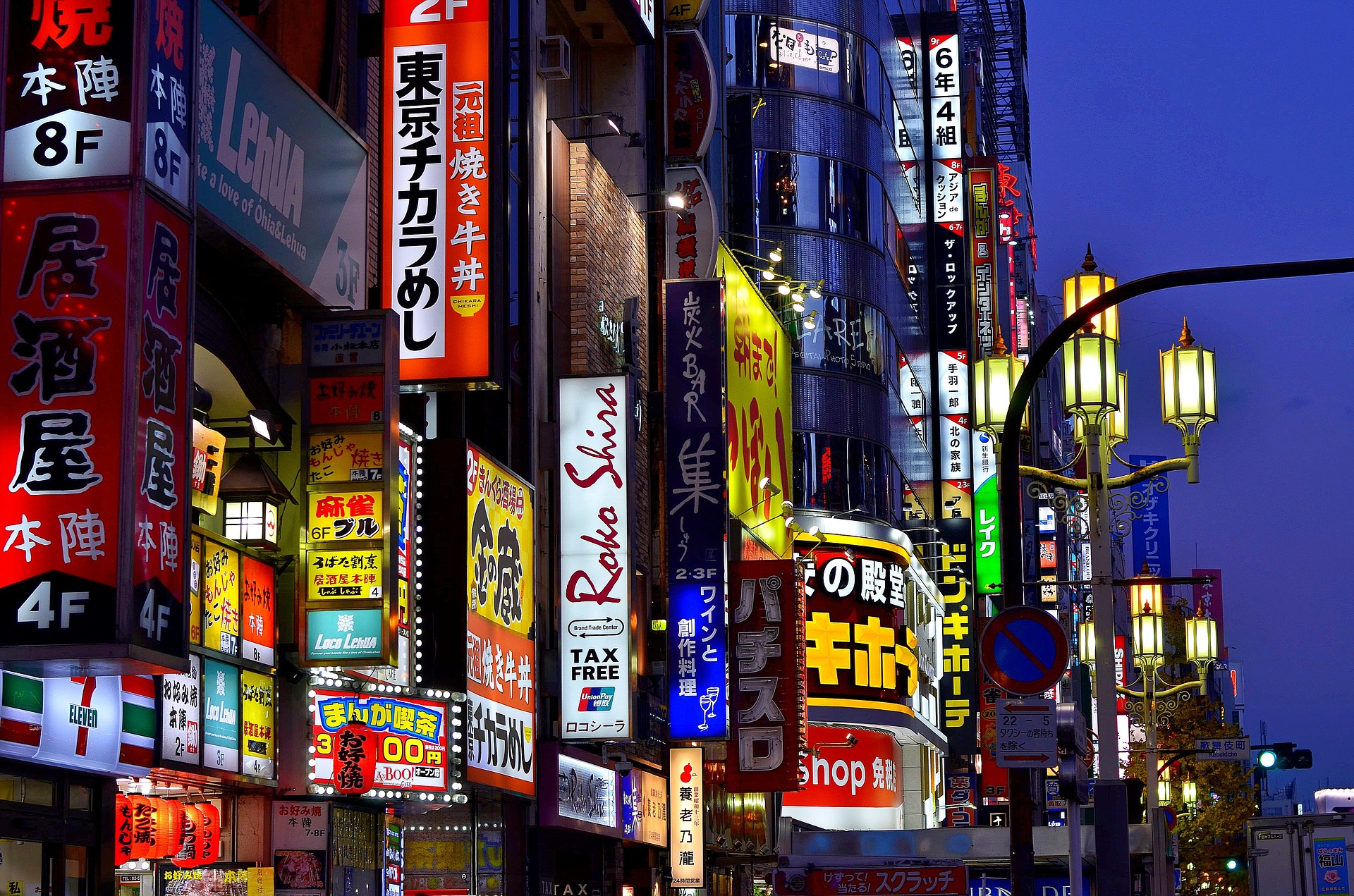
A lot of the charm in the neon boards may also be attributed to the Japanese artistic calligraphy laying on the vertical panels. Chinese Kanji that is also used in Japanese calligraphy has been considered a supreme visual art so much that Picasso himself once said: “If I once lived in China, I must have become a calligrapher rather than a painter.”
“Calligraphy was modeled after painting a Chinese stone monument with ink and copying it onto paper. Since the inscriptions on the stone monument were vertical, Japanese was traditionally only written vertically. Haiku (俳句) or Japanese poetry, Kakejiku (掛軸) or a hung scroll, and old writings that use Kanji were all written vertically. Thus, Japanese people are accustomed to vertical writing, which explains why there are many standing signs with vertical writings on them,” said Noriko Iwasaka, a professional contemporary Japanese Calligrapher who had been practicing the art of calligraphy since the age of three.
“Writing beautiful characters was thought of as a wonderful form of art, and people who wrote beautiful characters were trusted more in the past,” Iwasaka said.
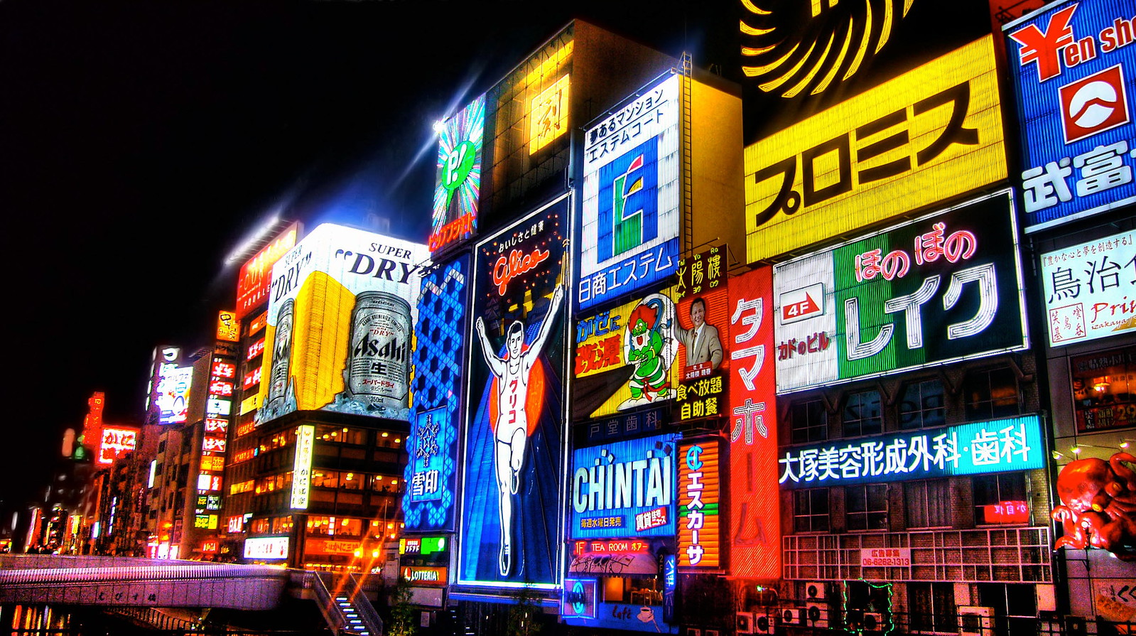
The Dotonbori area in Osaka was one of the first places to adopt the neon board advertisement technique. Today, tourists can be seen visiting Dotonbori to take selfies in front of the legendary running man, which the Japanese candy brand ‘Glico’ hung to advertise itself in 1935.
 The Glico man advertisement showing in the middle was hung around 1935 in Dotonbori, Osaka, Japan. (Supplied)
How are neon advertisements boards made?
Once a specific design is decided, a blueprint is printed for reference. After that, the right colors of neon tubes are selected, and straight glass tubes are progressively molded into the suitable form.
The molding process is all done through heat. At first, the ends of the tubes are heated on a flame burner to join together. Heat is also applied at inflection points before bending the tube to mold the required curvature to build the shape. The tubes are heated slowly and carefully to avoid cracks from thermal expansions. Even a very skilled neon-craftsman could cause the delicate neon tube to snap. Minor errors like that could cause the craftsman to have to redo the entire process.
A unique kind of intuition grows with the neon craftspeople that allows them to develop the skill of knowing when and where heat should be applied during production.
The craftsman repeatedly refers to the blueprint to match the crafted work with the proper measures, bends, and overall shape. Once the neon signage has been molded, it becomes time for it to be lit.
Aside from the exterior colors of the tubes, the gas pumped into them is also taken into account. Every gas has its owncolor, so while neon gas is used for red signs, Argon gas is used for blue signs. Mercury is also added at times to enhance the color.
Electrodes are then attached to the ends of the designed form, and contaminated air is extracted prior to the insertion of pure gas. Finally, the light is tested, and the gas is sealed inside.
The completed work is then hung on one of the storefronts, supplementing the city’s overall neon collage.
 Neon signs of Tokyo, Japan. (Supplied)
Three things contribute to the beauty of signage: Proportion, light, and text. In this scenario, the text present on the neon boards, which is often displayed in a calligraphic manner, reflects different cultural aspects.
“Calligraphy expresses the spiritual culture of the Do (道),” explained Iwasaka.
“‘Do’ is unique to Japan and not found in other languages, which makes it distinctive to the Japanese culture. Other terms we use repetitively are ‘Omotenashi (おもてなし)’ which reflects the prominence of hospitality, ‘Mottainai (もったいない)’ which emphasizes regret over waste, and ‘Kawaii (かわいい)’ which reveals the appeal of cute things in Japan,” Iwasaka said, adding that even words like ‘Tsunami (つなみ)’ can reflect aspects of the natural phenomena of the country.
This highlights the significance of the terminology present on the boards, which not only serves as an indication of the business it represents but also as a cultural characteristic.