DUBAI: Lebanese comic-book artist and illustrator Raphaelle Macaron has become one of the most sought-after artists in the Arab diaspora. Her eye-catching work is reminiscent of the colorful, cartoonish Pop Art movement and vintage Egyptian movie posters. The Beirut-born, Paris-based artist’s inspirations range from current affairs to record sleeves of the Sixties and Seventies. Her illustrations have been commissioned by The New Yorker, The New York Times, The Washington Post, Amnesty International and others.
Macaron’s love of illustration stretches back to her childhood and her mother’s collection of French comic books. Superhero comics and graphic novels from the US soon followed.
“What I like about comics is mostly the fact that they unite two things I love the most — drawing and storytelling,” she told Arab News. Her work takes an often-ironic and humorous look at modern life, and champions influential Arab cultural figures. So, what does it take to create a good piece of illustration?
“The term ‘illustrating’ is a precise one,” she explains. “You need to illustrate a thought, a feeling or a political message. A good illustration needs to have a message that is very efficient, very understandable, and creates empathy with the reader.”
Here, Macaron talks us through some of her favorite pieces.
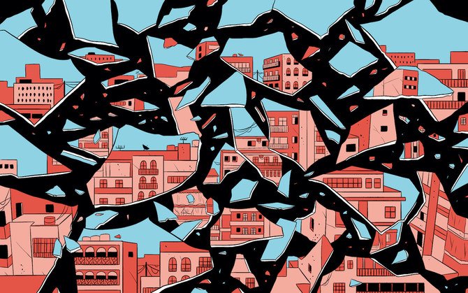
‘Beirut Explosion’ (2020)

This image of the broken glass was the first one I made about the Beirut explosion, one month after it happened. L’Orient Le-Jour, the French-speaking newspaper in Lebanon, asked me to do the illustration. It was difficult, because I literally had no words and no thoughts. I felt I had no purpose and was completely confused. At the time, it was the only image I could come up with because I was not capable of having a punch line or a strong message. I just felt really broken. What was really difficult, being away from Beirut at the time, was trying to understand the gravity of the situation. What I missed the most was being in the streets and being able to have a mental map of the things that do and don’t exist anymore. In my head, it felt like everything was destroyed.
‘Anatomy of a Nightmare’ (2020)
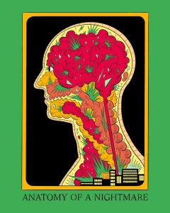
I did this six or seven months after the explosion, after having lived with the thought of it for a longer time, which obviously comes with Post Traumatic Stress Disorder. It was part of a project called “Micro-commissions” that was launched by the Beirut Art Center, where they asked five artists to make daily drawings of whichever cycle they were in. I was in the cycle called “I Draw The Line Here.” It’s obviously about the explosion, but I’m just realizing now that it’s not too far from the Edward Said image. It’s also about the inner violence that you can carry along with you in your normal life. I feel like this is a recurring theme in my work: How alive, in both enriching and heavy ways, the inner landscape can be.
Edward Said (2021)
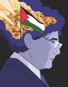
This drawing was initially commissioned by a magazine three weeks before the events in Palestine began. There was an angle in the article that I found very moving, which is the feeling of always going on with your life with that violence and heaviness inside of you. As an expat I really related to that. The article talked about how Said was always conflicted between his academic life in the United States and how he wanted to have a pragmatic view on things. He wanted to talk about the Palestinian cause in terms that the American people would understand. By definition, these terms were flawed and didn’t depict the exact reality. They were depicting him as this person who was torn his whole life. I felt it was interesting to show this contrast; showing him alone with a very violent inner struggle. I regularly use colors to contrast a message and, in this case, Said being in cold, calm colors and having something very bright and intense in his head felt right.
‘Nancy Jazz Pulsations’ (2021)
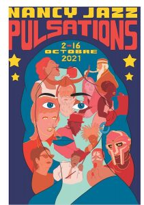
This was a dream project. I’m a huge music fan and a compulsive record collector. I was asked to create the whole identity of this year’s edition of this music festival in France. It’s a series of five posters, but this is the main one. They all follow the same principle, which is basically a portrait with projections on the face. I wanted to use this opportunity to talk all about my musical references as well. Who can we see? There’s Umm Kulthum, David Bowie, Billie Holiday, Nina Simone, Moondog, Lauryn Hill, and Kurt Cobain, who was my teenage sweetheart. When I draw posters, typography is one of the most important parts of an illustration; I draw all the fonts that I use.
‘Visit Beirut’ (2018)
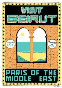
I’ve grown a bit tired of this image because it’s been seen so many times, but I wanted to include it. I made it almost four years ago as part of a personal exhibition, which had fake ads for Beirut. They were, for me, so obviously ironic. The point of the exhibition was to basically take the orientalist view of Beirut as being this ‘perfect city’ between the East and the West. It ended up being one of my best-selling prints. It resonated with a lot of people. I feel like this print really represents the tone of my work; there’s a lot of irony and humor. Irony is not just a big part of my work, it’s a big part of my life.
‘Warda’ (2020)
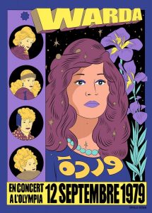
I was asked by Institut du Monde Arabe in Paris to create merchandise for their “Divas Arabes” exhibition. It was a dream for me because I had to make concert posters of three strong women: Umm Kulthum, Fayrouz, and Warda. I remember watching Warda’s concerts and was struck by her outfits and her record covers. She had so many crazy hairstyles. I didn’t know which one to choose. She just looked so awesome all the time. The main focus was trying to fit all her hairstyles into one composition. I had a lot of fun doing it. The typography looks like it comes from a sci-fi movie with the 3D effect.
‘Society Magazine’ (2020)
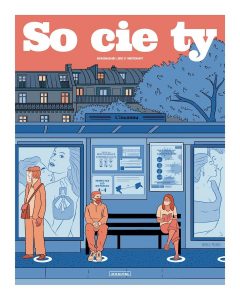
This was the first cover I did for Society Magazine. It’s close to my heart because I did it during the first lockdown. It was meant to be the first issue after lockdown in France, so it was an important moment for me and for everyone. I put a lot of thought into how I could create a single moment in a scene that captures exactly how we feel about proximity. I was scared of going out, because I didn’t know what the world would be like now. We had to wear masks at that point, which was a crazy thing back then, but now it’s very normal. It was almost cathartic to work on this. Some people thought it was a dramatic drawing. But for me, it was really funny.